Walkthrough of the Template
The UH Department Dashboard Template is a static site that illustrates the proposed design with hypothetical data. This page describes the major components.
Academic Year View#
The landing page of the template at https://uh-dept-dashboard.github.io/uh-dept-dashboard-template/ presents the "Academic Year View". This view is intended to provide a "global snapshot" of the state of the academic unit for each of the past five academic years. The page provides a set of measures chosen by academic unit as being useful to characterizing their teaching, research, service, and resources. Here is a partial screenshot:
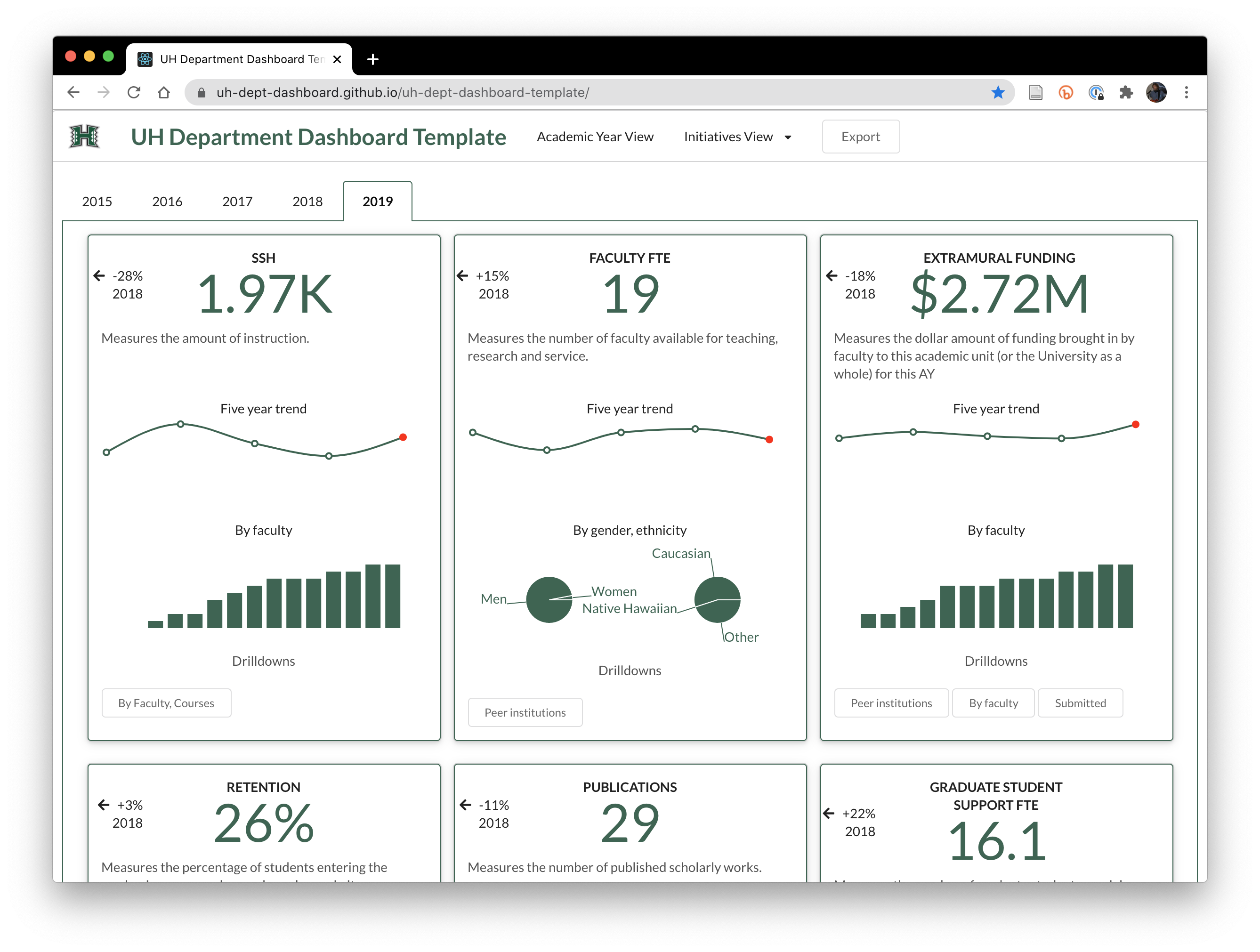
The landing page of the mockup has examples of over a dozen Measures in order to provide a sense for range of data that might prove beneficial to an academic unit.
Each Measure has the following components:
- A numerical value providing a summary statistic of that Measure for the current academic year.
- A Five Year Trend chart. This chart shows how the Measure value has changed over the past five years, if that data is available.
- One or more "Spark Charts". This page also shows one or more "Spark" charts for each measure, illustrating other aspects of the Measure.
- One or more "Drilldowns". For a more detailed look at the Measure, the Measure contains links to pages containing more detailed "drilldowns" on the Measure.
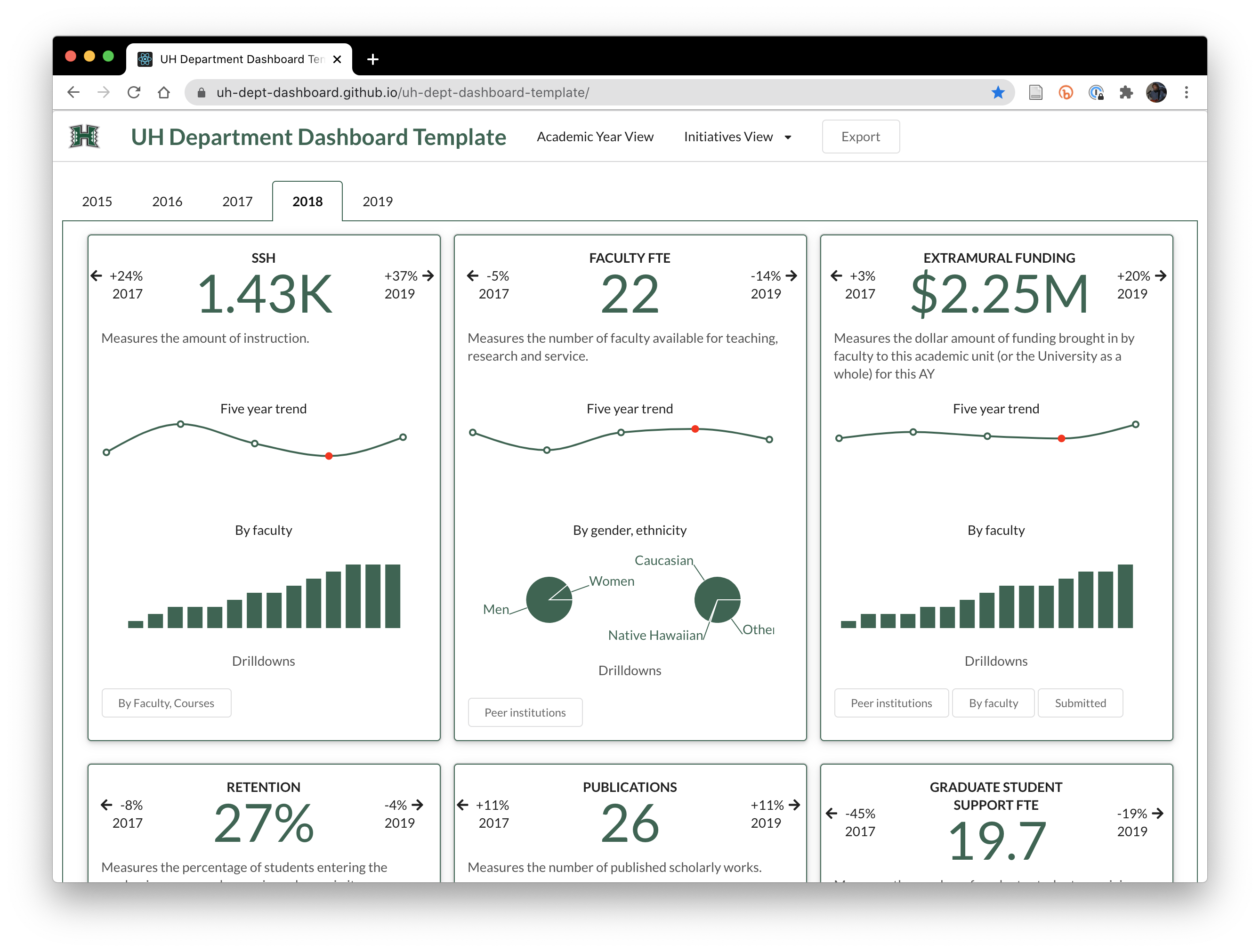
The Academic Year View contains tabs for five years of data which enables the user to obtain a sense of how the set of Measures are changing over time. Here is the previous year tab:
AY View: Drilldowns#
The numeric value associated with a Measure is rarely sufficient by itself to understand the underlying challenges and/or opportunities in the academic unit. Each Measure can have any number of "Drilldowns" associated with it, which provide a detailed perspective on some aspect of the Measure. Here is an example:

This drilldown shows results for a course evaluation question on a course-by-course basis.
Initiatives#
While a "global snapshot" can be useful for identifying a suddenly changing Measure value, or perhaps a chronically bad Measure value, it has the danger of being "noisy"---just a bunch of numbers, many of which might not mean anything important to the academic unit at present.
To address this weakness in the global snapshot perspective provided by the Academic Year view, the dashboard also contains an additional set of pages under the "Initiatives" menu.
Each initiative page presents a custom set of charts that provide data regarding progress toward an initiative of interest to the academic unit. Here are two examples to illustrate:
Initiative Example: Diversity#
Let's say an academic unit has identified a lack of diversity as being an important problem to be addressed. They could construct an Initiative page that presents a set of charts that focus on Measures that provide evidence regarding progress toward diversity:
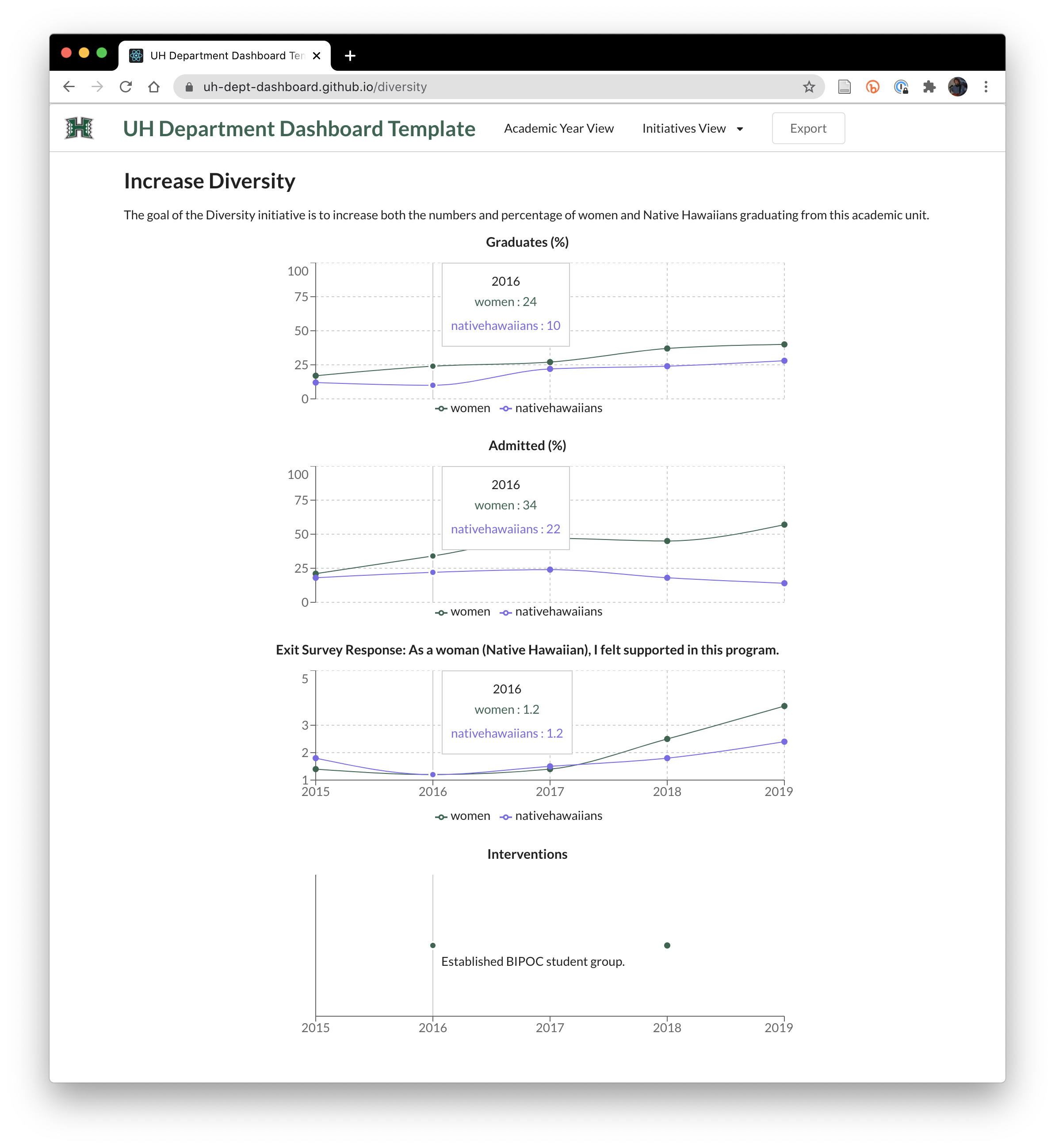
This page is available at https://uh-dept-dashboard.github.io/diversity.
In addition to the charts showing Measures related to the initiative, the page has an "Interventions" timeline. This enables the academic unit to specify changes they have made to the programs or policies of the department, which are intended to eventually produce a change in the Measures being tracked.
Initiative Example: Professional Preparation#
A second example of an Initiative is "Professional Preparation". Let's say an academic unit wants to increase the readiness of its graduates to enter the high tech workforce. This initiative page enables the unit to track its progress:
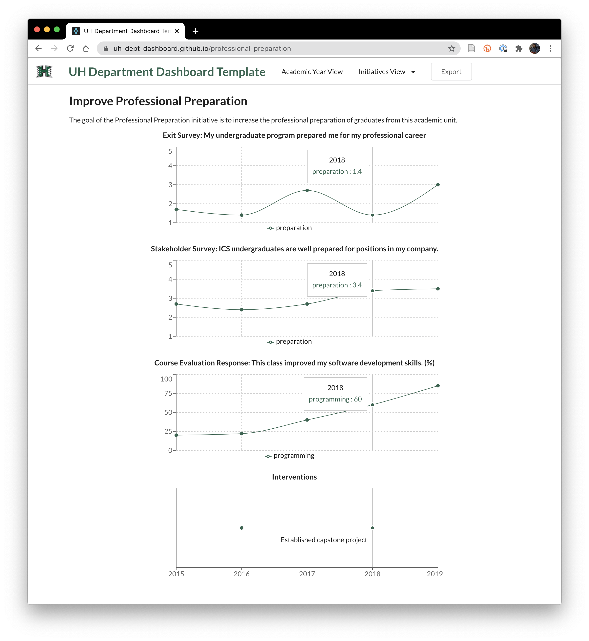
This page is available at https://uh-dept-dashboard.github.io/professional-preparation.
Export Data#
The dashboard navbar contains a button named "Export":

This button will provide the user with a copy of the dataset displayed by the dashboard. The Export button is motivated by the knowledge that the dashboard will often raise more questions than it answers, and that the built-in set of drilldowns or initiatives might not provide all of the useful perspectives. The Export button makes it easy for faculty to download the data and play around with it in new ways. Hopefully, if the results of these explorations are useful, a new Drilldown or Initiative can be incorporated into the Dashboard at a later time.